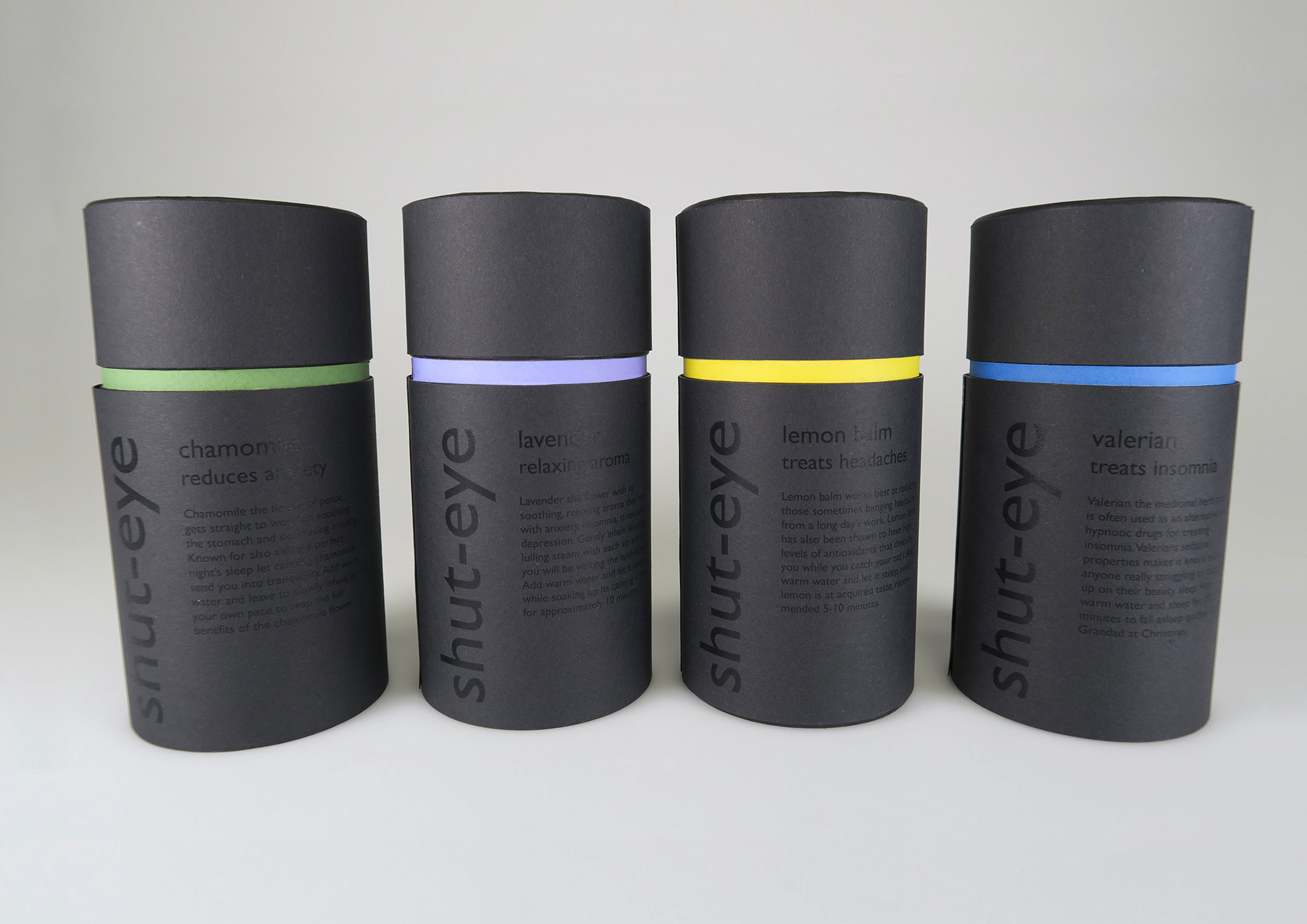
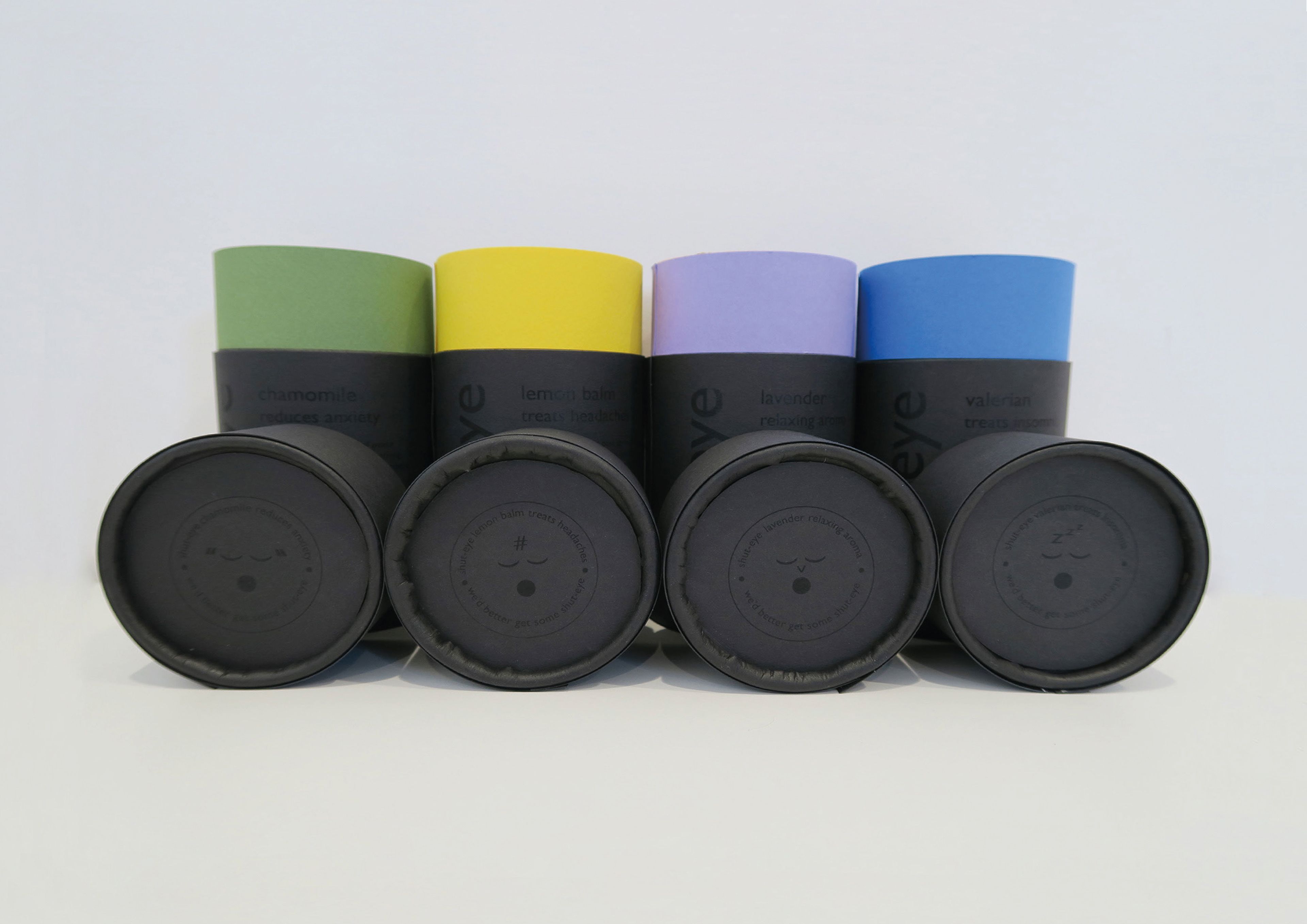
Packaging
Shut-eye is a bed time tea that helps you unwind at the end of the day. The target audience is DINKY’s (dual income no kids) that are health conscious, environmentally friendly and have disposable income. Shut-eye’s brand values are: relieves stress, aids sleep, functionality, natural, holistic, ethical, fair trade and environmentally friendly. Shut-eye’s brand look is: gender neutral, high end, fresh, sleek, straightforward, luxury and to have an obvious focus on sleep.
Logo
The logo adapts to each flavour of tea and its special function. For example, chamomile is used to reduce headaches so as well as the staple logo of closed eyes and yawing mouth it has added apostrophes on either side to resemble the pulsing feeling you get when you have a headache. Each special feature resembling a type of stress is made out of a keyboard symbol. This gives Shut-eye a relevance to its target audience whom regularly use technology and emojis as a form of communication.
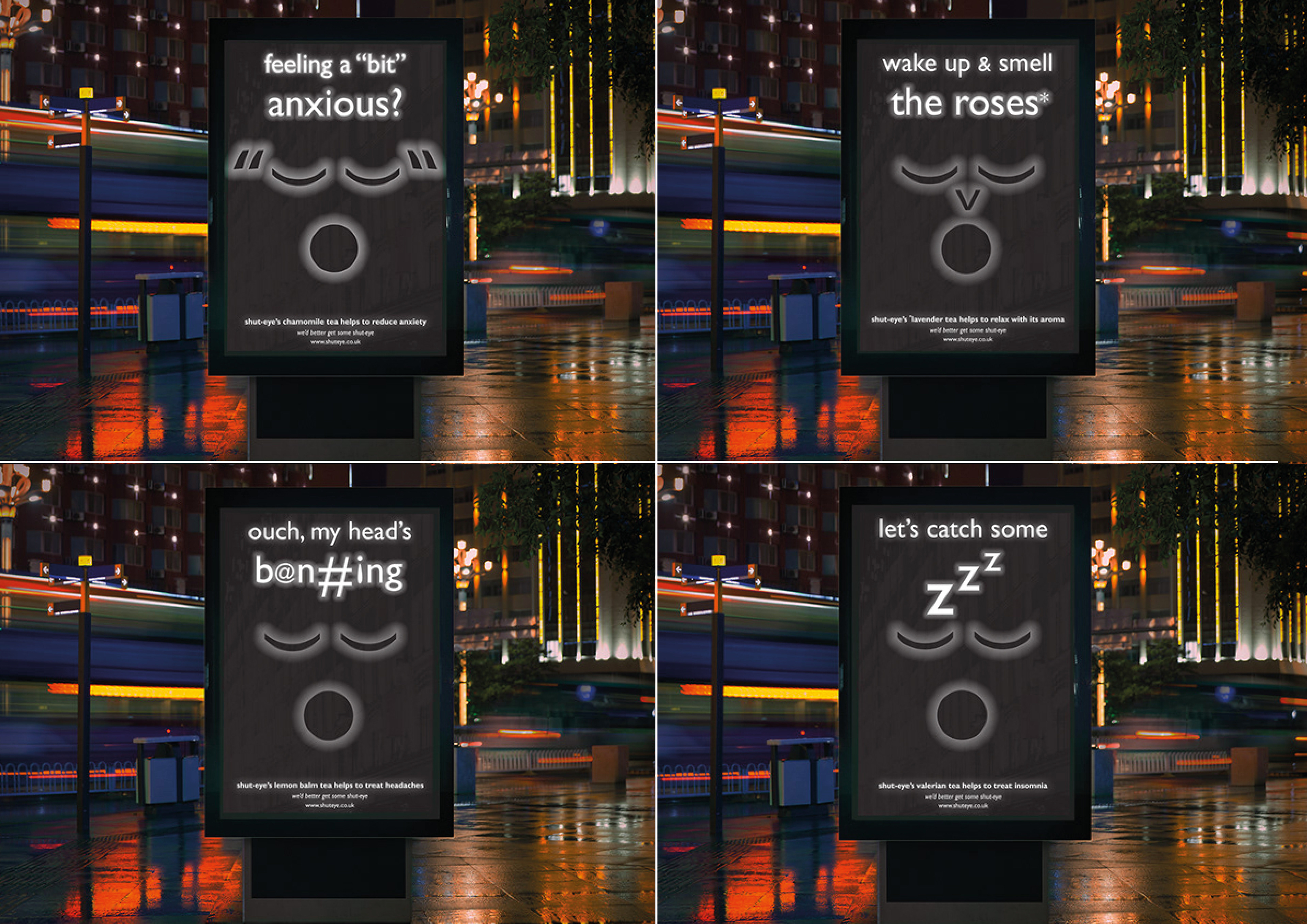
Ad Campaign
Shut-eye has four posters that light up at night to promote each individual tea. Each poster has the individual faces that represented the four flavours on the packaging. The light up aspect fits Shut-eye’s ethos because it attracts the type of people who might be up and about at night because they cannot sleep.
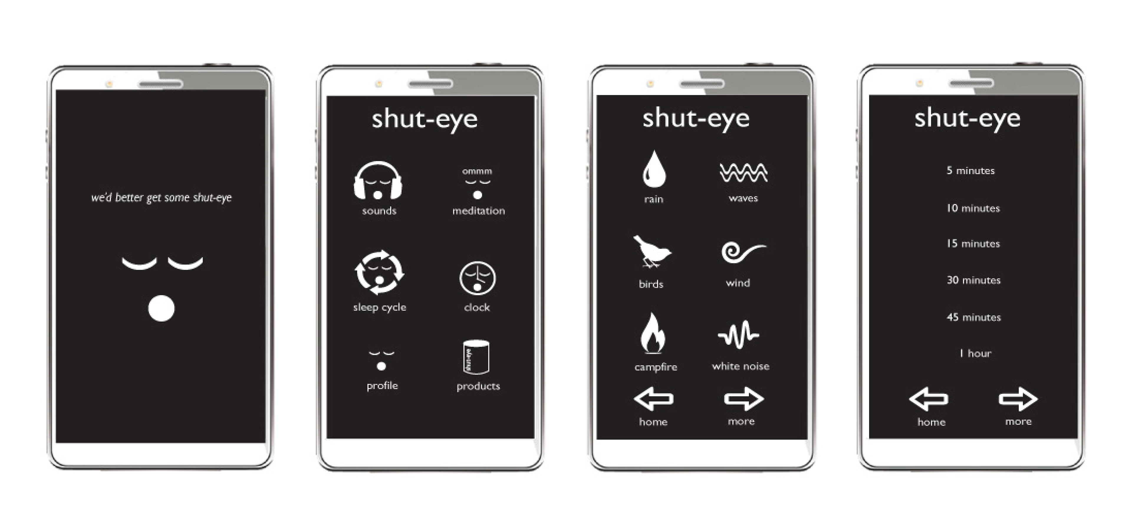
App Design
To accompany the range of teas there is a sleep app. Features include: relaxing sounds, meditation sessions, a clock, your own profile where you can keep track of your sleep cycle and an easy way to purchase Shut-eye’s products.